text gradient
-
To create a text gradient effect in CSS You can use the
background-clipandtext-fill-colorproperties. Here's an example:/* Define the gradient */ background: linear-gradient(45deg, #ff0000, #00ff00); /* Apply the gradient to the text */ -webkit-background-clip: text; -webkit-text-fill-color: transparent;This will create a horizontal gradient effect on the text, with red on the left and green on the right. Note: This effect is currently only supported in webkit-based browsers (e.g., Chrome, Safari) using the
-webkit-prefix. -
Add text gradient animation in css You can use the
@keyframesrule to create the animation and apply it to your text element css animation attribute.animated-text { font-size: 48px; background: linear-gradient(-45deg, #ee7752, #e73c7e, #23a6d5, #23d5ab) /* 将背景gradient的范围放大到400,在keyframes中调整当前的渐变位置 */ background-size: 400% 400%; text-align: center; -webkit-background-clip: text; -webkit-text-fill-color: transparent; animation: gradientAnimation 10s ease infinite; } @keyframes gradientAnimation { 0% { background-position: 0 50%; } 50% { background-position: 100% 50%; } 100% { background-position: 0% 50%; } } -
Metallic gradient effect
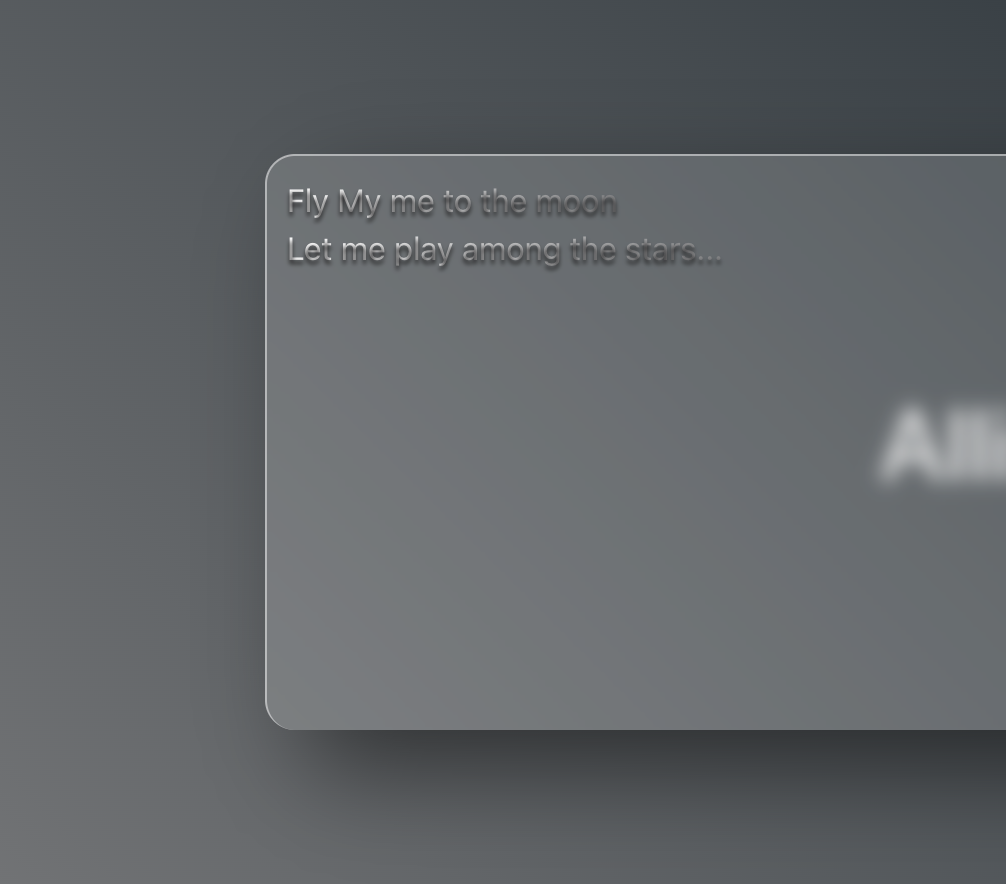 To create a font that visually resembles a metallic effect using CSS gradients is quite straightforward. The first step is to change the font to your preferred gradient colors, as shown in the example below:
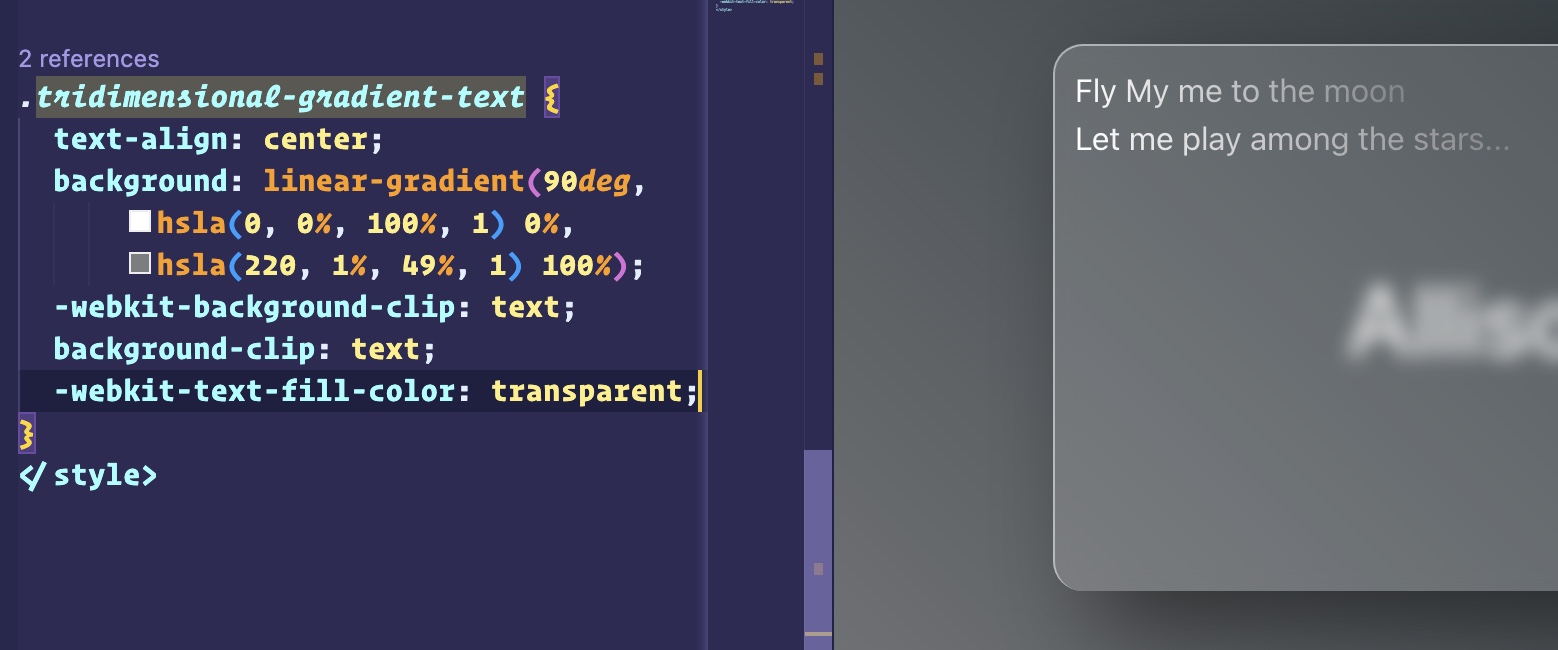 The second step is equally important. To give your font a three-dimensional appearance, you must apply a border to it. This requirement can be easily achieved using a CSS property:
 text-shadow.tridimensional-gradient-text { text-align: center; background: linear-gradient( 90deg, hsla(0, 0%, 100%, 1) 0%, hsla(220, 1%, 49%, 1) 100% ); -webkit-background-clip: text; background-clip: text; -webkit-text-fill-color: transparent; text-shadow: 0 2px 2px #1a191a; }